Company
Role
Design System Designer
Project Type
Timeline
2024


This work comes from a live enterprise product environment with multiple teams and products. Due to NDA, details are anonymised, but the system, decisions, and impact are based on real implementation.
THE OVERVIEW
This project came from a growing enterprise product ecosystem where multiple teams were building in parallel.
On the surface, the products were working. But across the ecosystem, the experience was starting to drift. Similar components were being recreated, patterns were not always consistent, and teams were spending time aligning on things that should have already been defined.
That is where the project began — not with a new interface, but with the need for a shared foundation.
THE BREAKING POINT
When I audited the ecosystem, the pattern was impossible to ignore. Different products were following different guidelines, and the same UI problems were being solved in different ways.
Components were rebuilt instead of reused.
Visual language shifted from product to product.
Behavior became harder to predict.
Every handoff needed more explanation than it should have.
What looked like small inconsistencies at first was actually a much bigger issue:
The product was scaling without a shared foundation.
Every new feature did not just add value. It added more design debt.
THE APPROACH
We didn't need a UI refresh. We needed organizational infrastructure.
However, there were no resources or budget for a dedicated DesignOps team. We had to fix the foundation incrementally while continuing to ship products in our day-to-day workflow.
So the approach was simple:
Work with what exists. Improve it where it breaks. Scale it as it stabilizes.
01
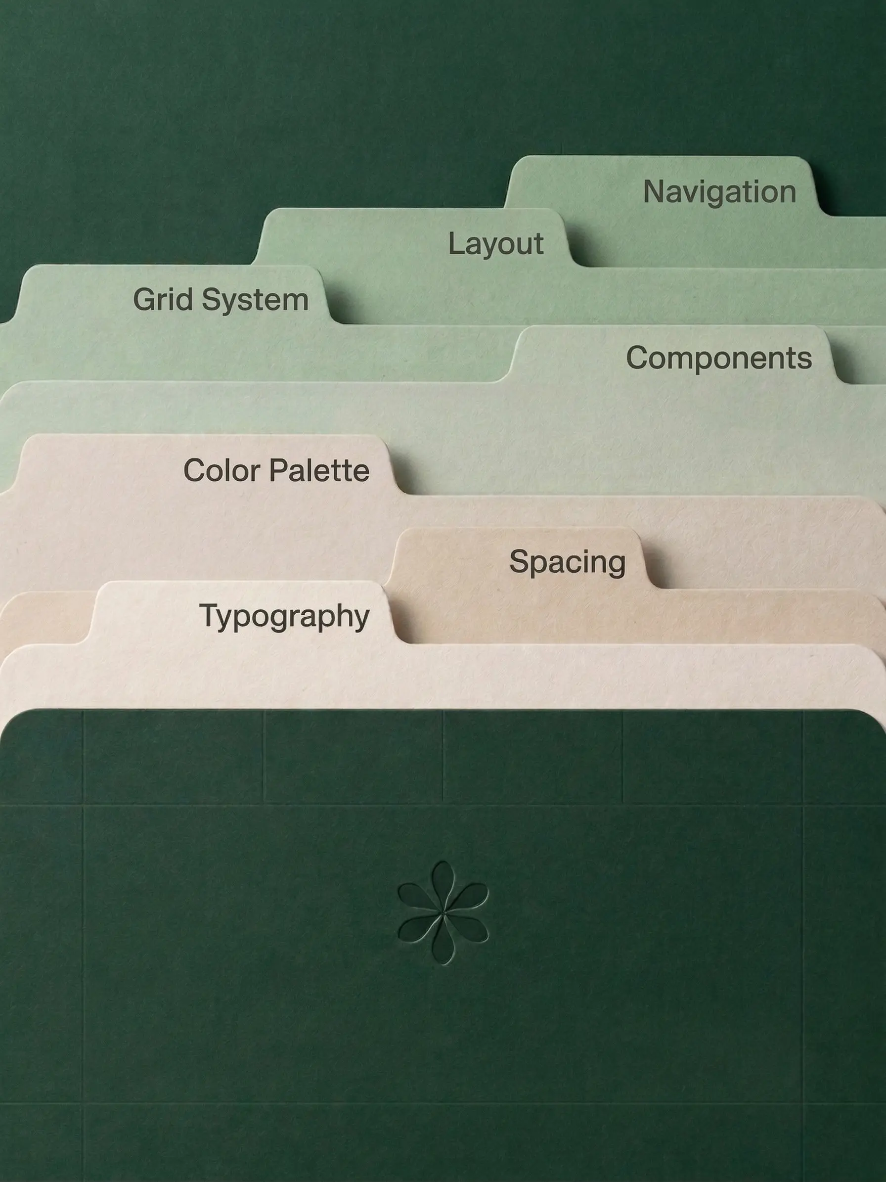
The audit: Tidying the ecosystem
We started with a "Marie Kondo" approach to our UI. We compiled every existing style, token, and component across the platforms, categorized them.
Similar components were merged. Unnecessary variations were eliminated. Styles were simplified into a smaller, usable set.
Because a system doesn’t scale by adding more. It scales by becoming clearer.
02
Defining a shared foundation
Style guidelines often fail because they are too complex and take days to read.
I established global guidelines that were deliberately concise. Keeping the documentation brief ensured it was actually consumed and remembered by the product teams, perfectly balancing creative freedom with strict system consistency.
03
Aligning design with development
I built the core component library in Figma.
By structuring the token architecture and naming conventions to directly match the engineering implementation, we removed the guesswork. Token naming and structure matched implementation, so developers could use components without reinterpretation.
04
Integrating into real product work
A system fails if nobody adopts it. Instead of a massive, disruptive overhaul, we integrated the new system organically.
We synced with other designers to establish a multi-team contribution workflow. We targeted high-impact elements first, like colors, global navigation, and buttons, slowly replacing legacy components as we touched them during regular sprints
TURNING POINT
The system started working the moment it reduced friction
The shift was not visual. It was operational.
Once the structure was in place, small changes no longer needed to be explained product by product. A button update could flow through the system. Developers could use components with the token logic already built in. And questions that used to trigger repeated clarification now had the same answer across products.
That was the moment it changed. The system stopped being something we maintained, and started doing the work for us.
5+
Teams actively adopting
~45%
Faster dev cycles
Also significant reduction in duplicated components
WHAT I LEARNED
Systems fail when they don’t fit how teams work
The hardest part wasn’t building the system, it was getting teams to actually use it. I realized quickly that even a well-structured system fails if people don’t see its value or feel part of it. That changed how I approached it.
Instead of trying to make it complete, I made it usable early and improved it alongside real product work, which made teams engage with it and start contributing.
Over time, the impact became clearer, not in how things looked, but in how work happened. Fewer repeated decisions, less back-and-forth, and more clarity across teams. That’s when it stopped being a design effort and started working as part of the product itself.